Launch Box Packaging

The Magic-Flight Launch Box is the first portable batttery powered vaporizer. Each one is handcrafted in San Diego, CA. In the spring of 2014 I worked with them to design new packaging for their main product.

Launch:
February 20, 2017

The Problem:

The legacy tin packaging didn't fit into the expanding product line's updated packaging. Furthermore, the opaque tin packaging meant buyers couldn't see the product without opening it. And that meant MAGIC-FLIGHT was missing an opportunity to convey their unique value prop in offering a handmade, one-of-a-kind artisan-crafted wooden vaporizer.

The Solution:

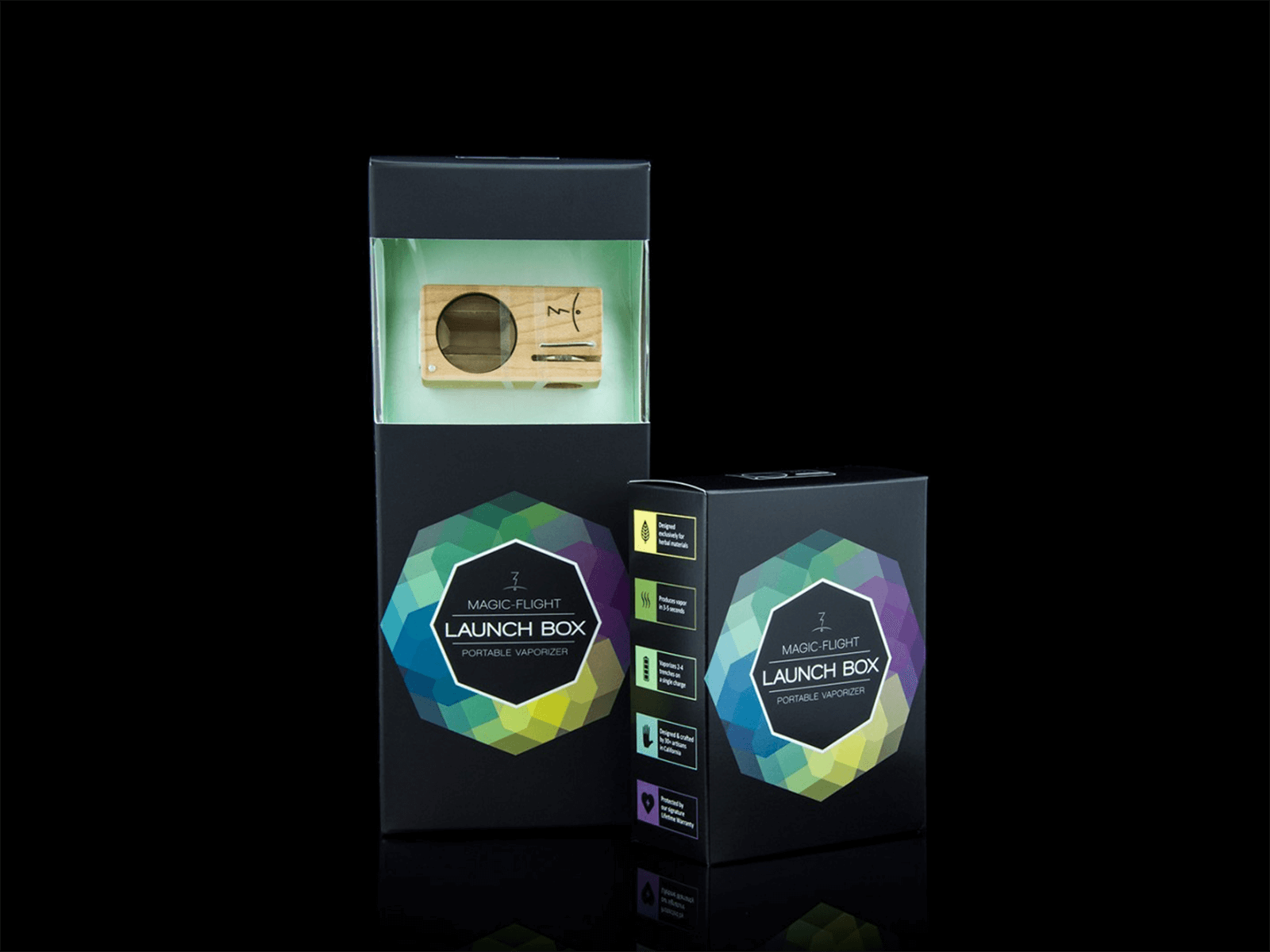
We brought the Launch Box into a windowed viewing port so buyers could see that it was wood and handmade. Plus, it gave them the freedom to choose which unique box they wanted. This idea reinforced the aphorism engraved on the back of each product "Love is that which enables choice; always stronger than fear. Always choose on the basis of love."

I derived the colors in the emblem on the front of the packaging from the existing MF colors of blue, green, purple and yellow. Later, I pulled from those colors to create a brand style guide with each product being represented by its own unique pop color. So every other product released by MAGIC-FLIGHT would utilize a pop color pointing back to its first and most popular product— the Launch Box.
No items found.

Launch Box Packaging

The Magic-Flight Launch Box is the first portable batttery powered vaporizer. Each one is handcrafted in San Diego, CA. In the spring of 2014 I worked with them to design new packaging for their main product.

Launch:
February 20, 2017

The Problem:

The legacy tin packaging didn't fit into the expanding product line's updated packaging. Furthermore, the opaque tin packaging meant buyers couldn't see the product without opening it. And that meant MAGIC-FLIGHT was missing an opportunity to convey their unique value prop in offering a handmade, one-of-a-kind artisan-crafted wooden vaporizer.

The Solution:

We brought the Launch Box into a windowed viewing port so buyers could see that it was wood and handmade. Plus, it gave them the freedom to choose which unique box they wanted. This idea reinforced the aphorism engraved on the back of each product "Love is that which enables choice; always stronger than fear. Always choose on the basis of love."

I derived the colors in the emblem on the front of the packaging from the existing MF colors of blue, green, purple and yellow. Later, I pulled from those colors to create a brand style guide with each product being represented by its own unique pop color. So every other product released by MAGIC-FLIGHT would utilize a pop color pointing back to its first and most popular product— the Launch Box.